GRAPHIc
DESIGN


AMAZON INFOGRAPHICS
THE BRIEF:
To create a series of infographics to be included on Amazon's emails to their vendors.
RESPONSE:
I designed multiple icons to represent each of the key areas they wanted to represent, keeping them clean and simple and screaming Amazon down to all the details.


BUSINESS CARDS
THE BRIEF:
I've included a selection of business card designs that I created, one for my current company Wooshii and the other for Rippin Sindher, a Creative Director and Filmaker.
RESPONSE:
These are contrasting business cards in very different styles for their different needs. I made sure to include QR codes in both in order to make them more functional for everyday usage. I decided to go for bold designs that make you stop and pay attention, with funky colours and stand out fonts to make it memorable.


ART FOR ART'S SAKE
THE BRIEF:
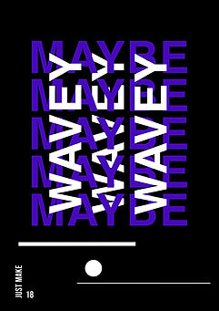
I started this project in lockdown, with way too much time on my hands and a realisation that I hadn't designed simply for designs sake in a long long time. The brief was simple, to design a poster every single day for a month to boost my creativity. The only constraints were that each poster needed to be A3 size and include the number and title.
RESPONSE:
This project was a real success, and something I'd like to try again now my design style and skills have evolved even more. This gave me a real sense of purpose while in lockdown and helped me grow my creative process and try new concepts I'd never had the chance to explore. Some days were more successful than others, and some days were easier than others, but that was all a part of the process!

THE REVOLUTION WILL NOT BE...
THE BRIEF:
These pieces were created in response to ISTD’s 2021 Student Award project; ‘The Revolution Will Not Be...’. We were tasked with creating a piece of typographical work that organises words in service of breaking barriers in relation to the UKs issues surrounding race.
RESPONSE:
I created 5 A3 protest signs to be used in protests and as posters. Each sign is double sided and depicts some of the most alarming statistics about police brutality and systemic racism in the UK. I think that education is key in turning the tide of these issues we are facing, especially seeing as many people in the UK believe the recent 2020 BLM protests were in response to systemic racism in the US and not in relation to issues here. The front of the signs depict statistics illustrated to the scale of the inequality they’re depicting. The back of each sign then repeats that statistic plainly so there is no room for misinformation.


MAKE SURE IT'S A YES
THE BRIEF:
This project is a proposed collaboration with food delivery service Deliveroo, in which limited edition packaging promoting consent would be available to businesses using their services.
RESPONSE:
Sexual assault and sexual violence are prevalent issues in the UK that need to be tackled. I believe one way of approaching this issue is by promoting conversation and education on the topic in order to destigmitise it. The largest majority of perpetrators for these crimes in the UK are men ages 18-35, which directly correlates to Deliveroo's majority customer base - therefore making this campaign a viable concept. This campaign would promote healthy conversation and help educate people on the topic of consent, by using sexual assault statistics on Deliveroo's packaging, which is available to all businesses using Deliveroo's platform via their website.


OTHERS ARE US
THE BRIEF:
For this project I chose to create the design for a children's book aiming to educate children about acceptance and anti-racism.
RESPONSE:
The book is based off Nathalie Handal's poem Others Are Us which I've listed below:
"He said I was different because I was dark. She said I was different because I wore a scarf. He said I was different because I had an accent. She said I was different because I couldn’t read. He said I was different because I stuttered. She said I was different because I couldn’t hear or speak. He said I was different because I should be a girl. She said I was different because I should be a boy. We are all different so doesn’t that mean we are the same? I mean it’s like heartbeats, we all share the same beats per minute but not exactly."


SWITCH
THE BRIEF:
I created this brand concept as a response to the Brandopus Student Chrysalis Awards in 2020. The brief was to create a drinks brand that is suitable for an adult drinking occasion with an additional functional benefit.
RESPONSE:
My concept is a non-alcoholic blackberry and ginger spirit brand called Switch that can be enjoyed in every season, on the packaging it includes examples of how Switch can be mixed at different times of year to make suitable non-alcoholic adult beverages. The additional functional benefit of this drink is that it is a healthy alternative to alcoholic drinks with a mature flavour. Most non-alcoholic drinks are quite childish with very sweet flavours and Switch challenges that. I chose to use an unconventional pyramid shaped bottle to elevate the design to appeal to a mature audience, it's something you want on display at home.